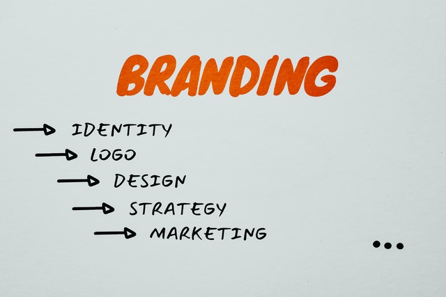
You’ll need a logo for various uses to create a memorable logo. We’ll look at your primary and secondary use-cases, brand personality, target audience, and typeface. Having an idea of what you’re aiming for can help you narrow choices and create a logo that reflects your business vision.
Consider your brand’s personality.
While designing a brand identity, you should always consider the brand’s personality. For example, a brand that aims to attract young people might adopt a more casual voice, while a more conservative brand may choose to adopt a more serious tone. The right brand personality must reflect the values and image of the brand, and you should consider how your target audience will feel about your brand. To determine your brand’s personality, you should conduct research. You can find out by looking at your competitors’ logos, metrics, and data. The more you know, the better your brand will be.
The best logos communicate essential information about the brand and are unique from others. Most logos need a facelift after a decade or so. Creating a logo is crucial. You can fine-tune your brand’s personality with time using a free logo maker, but it’s best to start by getting it right the first time. Otherwise, it’s likely to grow stale.
Consider your target audience.
Before you begin your design process, consider your target audience. Knowing your primary customer demographic will help you narrow your options for color palettes. Colors can increase brand recognition by 80 percent, so choosing colors that resonate with your audience is crucial. In addition, a logo should reflect the company’s culture, values, and mission statement.
Your logo design must speak to your target audience. Consider their personality and what they want to know. Apple’s logo, for example, does not show a computer, so make your logo reflect that. Instead, make it speak to your audience and appeal to their interests. For example, if you run a children’s toy store, consider a logo without a picture of a toy. Use childlike fonts and colors to appeal to a child’s eye.
Consider your typeface
You may not realize it, but a logo’s typeface is vital to its overall design. While a bold font with a modern design will catch attention, a delicate typeface with a vintage structure will have a softer, more traditional appearance. Alternatively, you may prefer the hand-drawn feel of a hand-painted typographic treatment. When creating a good logo, you must also consider the color scheme. If you want your logo to be eye-catching and memorable, choose colors to help your brand communicate its message.
For a modern logo, choose a sans-serif font such as Futura, a geometric font that projects optimistic modernism. Futura is a product of radical German experimentation in the 1920s. This typeface was designed in the Bauhaus art school, which advocated functionality and order. It is also believed that mass production and individual artistic spirit could co-exist. If you’re looking for a timeless, classic typeface, Futura is a great choice. Companies like FedEx and Swissair have established strong brand identities using this typeface.
Consider your color scheme.
A logo’s color scheme helps convey personality and a visual story to your audience. Cool colors give a feeling of sophistication and trust, whereas warm colors are associated with fun and joy. Colors also have subconscious messages, and combinations can provide instant direction to your brand.
A good logo designer will know which colors to choose for their brand based on their client’s target audience and industry. Colors are also linked to emotion and brand personality. A good logo designer will explain color associations based on 10,000 years of human culture. When choosing a color scheme, make sure it evokes a specific emotion and has a distinctive personality. This way, consumers will associate the color with your brand and avoid confusing it with other logos.


